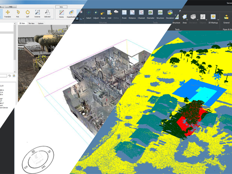
I lead a redevelopment of the interface for an entire application built from legacy code. This overhaul was initially done as an experiment in my own time, but slowly developed into a full project and covered both Qt and WPF interfaces. Eventually it was adjusted to fit within a global company design system and gained a light and dark mode toggle.
The original interface existed before I joined and was a mess of different designs from various code snippets, most of which appear to have originated from examples on the Qt tutorials. It didn’t have any design direction or consistency and had begun to look dated. In addition, despite being a Windows application it didn’t comply with any guidelines and window snapping didn’t work.
I first isolated the interface from the code by creating a mock-up of the current interface in the Qt Designer and modifying the stylesheet from there. After I was happy with that I brought the stylesheet back into the application, converted hard coded interfaces to Qt UI files and separated logic from interface code.

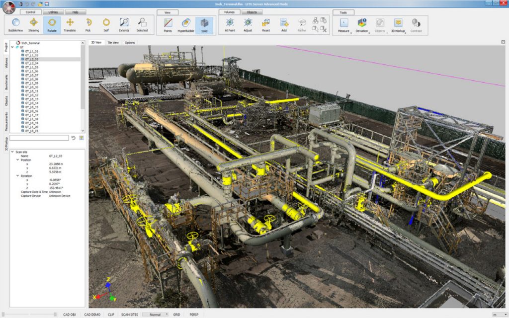
The first iteration of the interface was based on the style of Microsoft Office applications at the time, such as Word. It became a proper chromeless window which meant it retained snapping capabilities and behaved like a regular Windows application. It also gained a blue colour scheme, which was the company colour scheme at the time.
Eventually, the company colour scheme changed again and they wrote a list of guidelines for UX which meant another change to the interface. When making the first iteration I’d made sure to make it as flexible as possible, meaning the changes required were minimal.
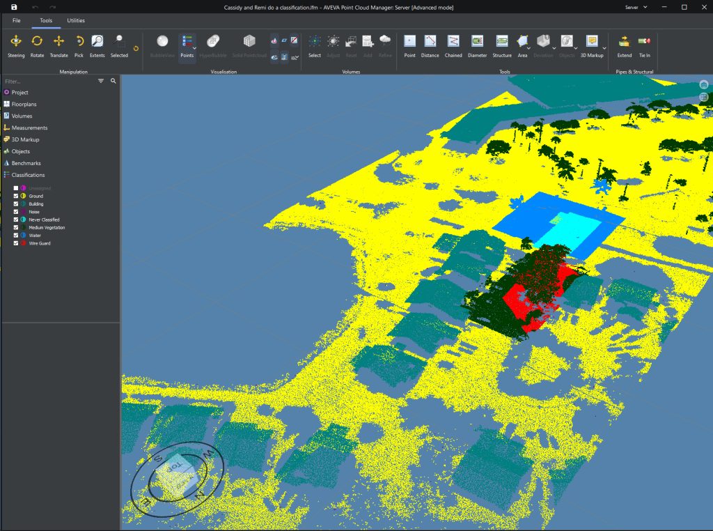
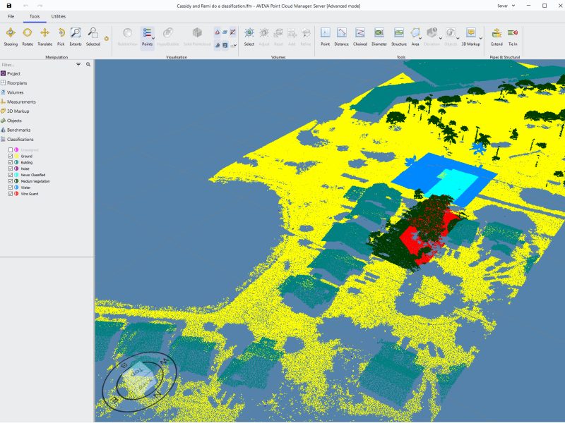
During this time we’d also developed a C# interface using WPF for cloud interaction which also had to be adjusted to match, but this was made flexible during initial development. The guidelines stated we should aim to add a dark and light mode into the application to allow the user to choose their preferred style, and to integrate into the operating system’s theme system so this was also integrated.
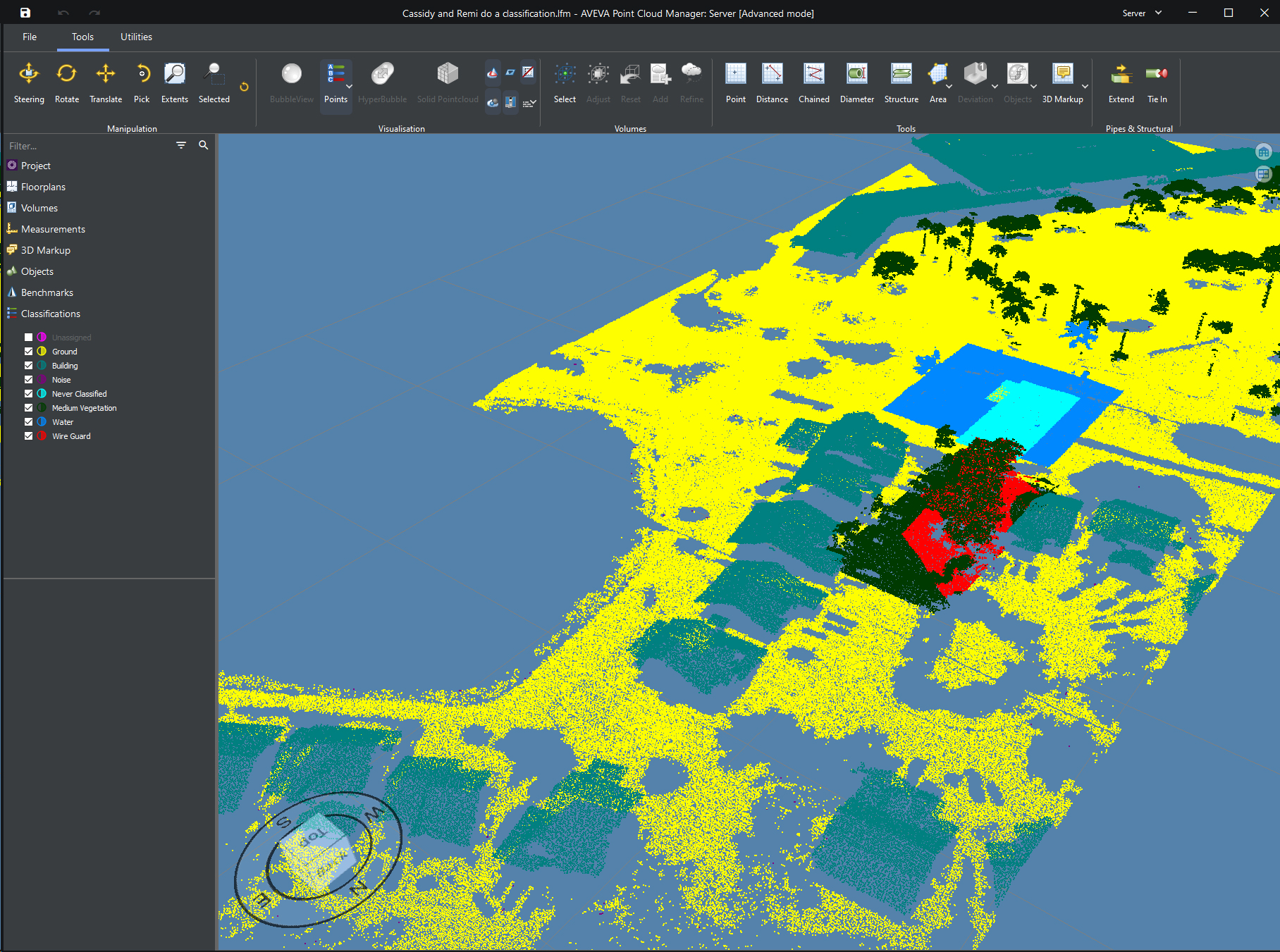

Despite the difference in the styling and rendering of elements in Qt and WPF I managed to match them together accurately enough to struggle to differentiate them from one another.
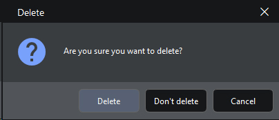

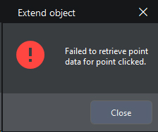
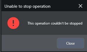

I feel like I should note that the icons remain mostly unchanged between all versions. The icons are very niche and only really relate to this area of business, so generic, open sourced icons such as Material Icons didn’t fit into all scenarios. Material icons were used wherever possible, as can be seen in some of the images, but custom icons were handled by another internal business unit that had a lead time in the order of years.
